First layer done! In this one I've chosen a cross perspective. As Ive tried to illustrate, you can imagine two lines going from one corner to another. One line is made up by the child and the butterfly looking at each other. The direction of the other line is made up by the green space between the angle of the jaw/mouth/nose and the hand.
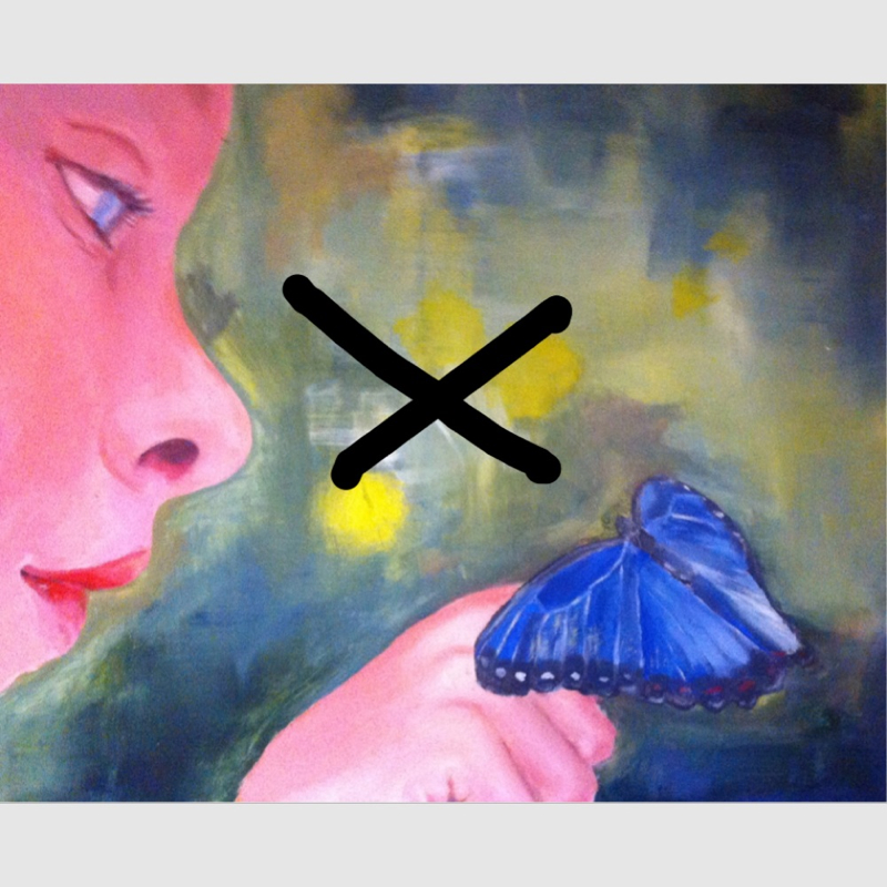
I'm not always thinking about perspectives though, sometimes I just go with my guts.
Another thing to think about is the coloring. I am not sure about what shade of green I'm finally going to use, and if I will keep the yellow dots. I'm looking for harmony between the colors. One way to think of it is in terms of opposite colors. Red opposed to green and blue to yellow. If the main color in a paintin is green, How many percent of the painting should be in red to create perfect harmony?
One example I like of a painting based on opposite colors is this one by Picasso.
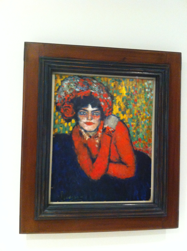
I took this (bad) pic while visiting the Picasso museum in Barcelona some months ago. I wasn't really permitted to take photos, ooouups :) at least I didn't use the flash.
 RSS Feed
