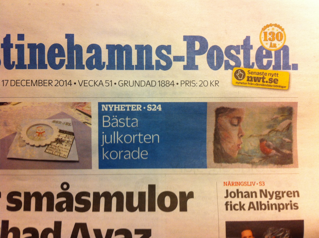
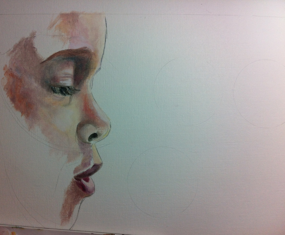
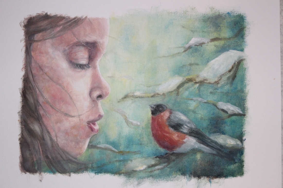
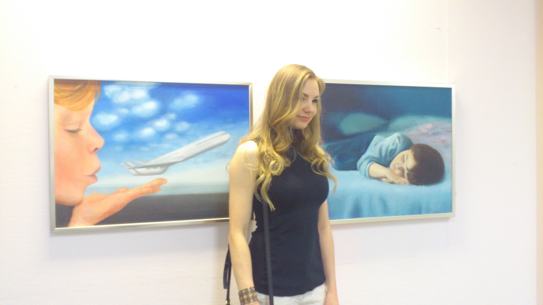
& then my contribution ended up on the first page in the news paper :)
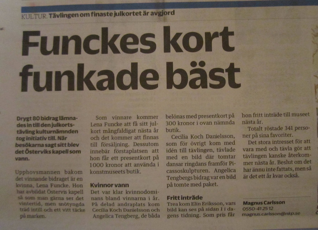
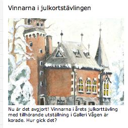
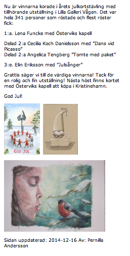
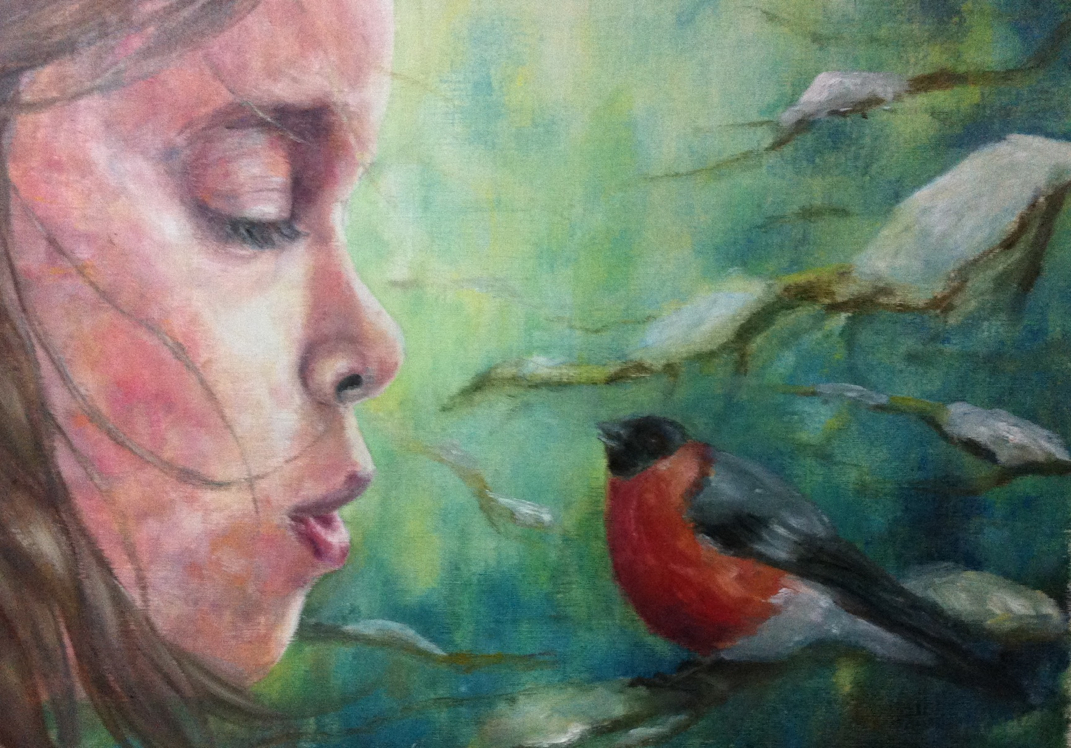
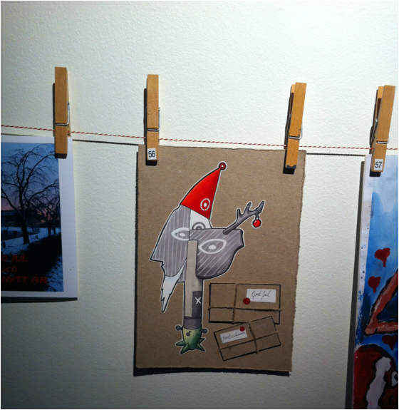
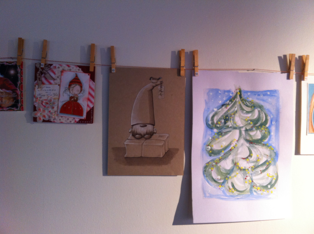
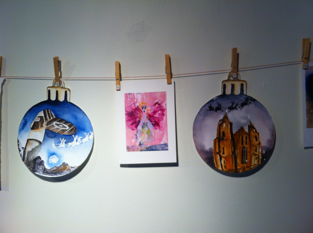
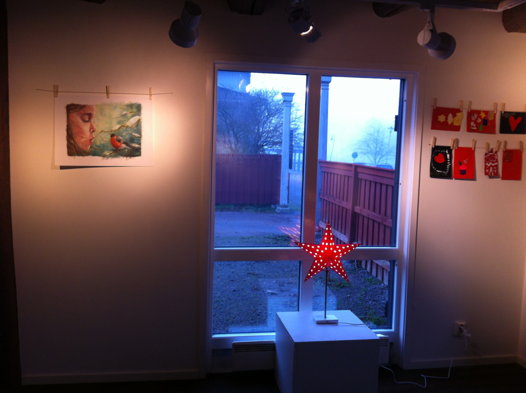
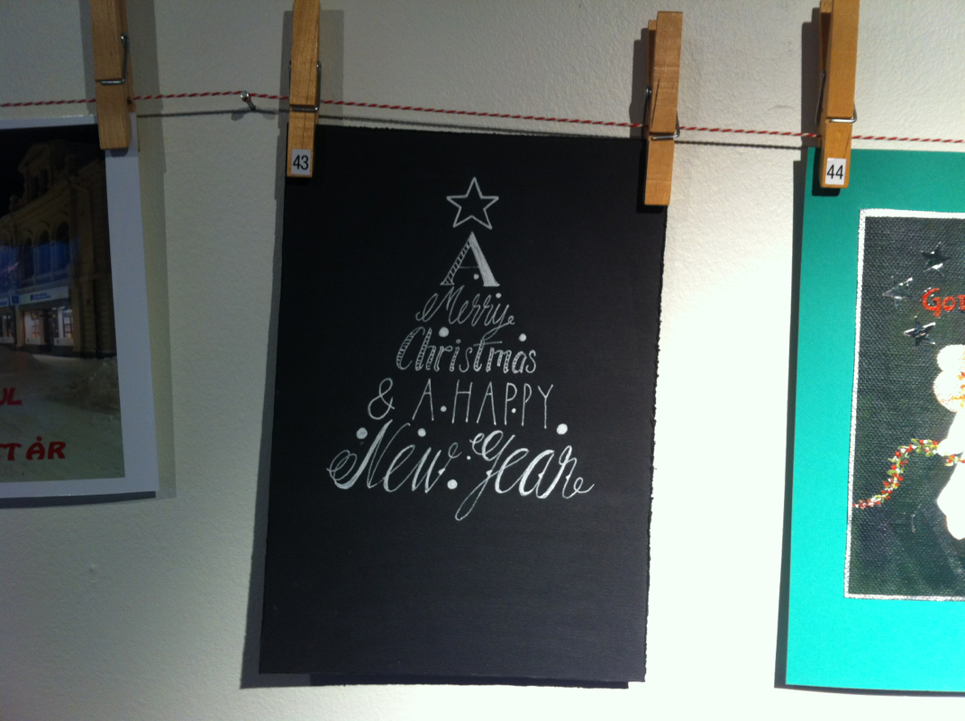
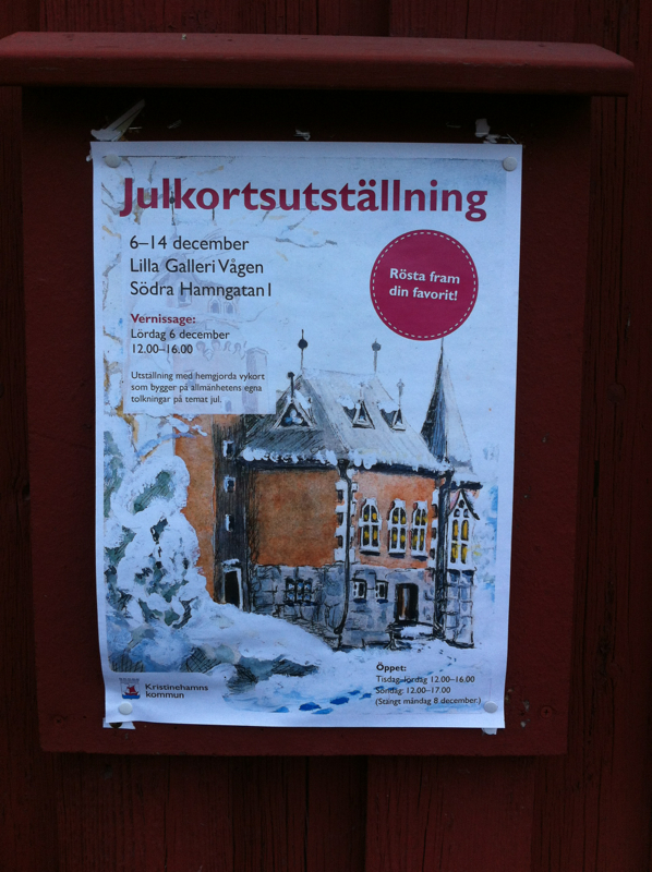
| Picture of the winning card, to the left. Painted by Lena Funcke. There were more than 80 postcards on display, and me winning the third place gives me a free entrance to the art museum next year - just perfect :) I will definitely use it well! | 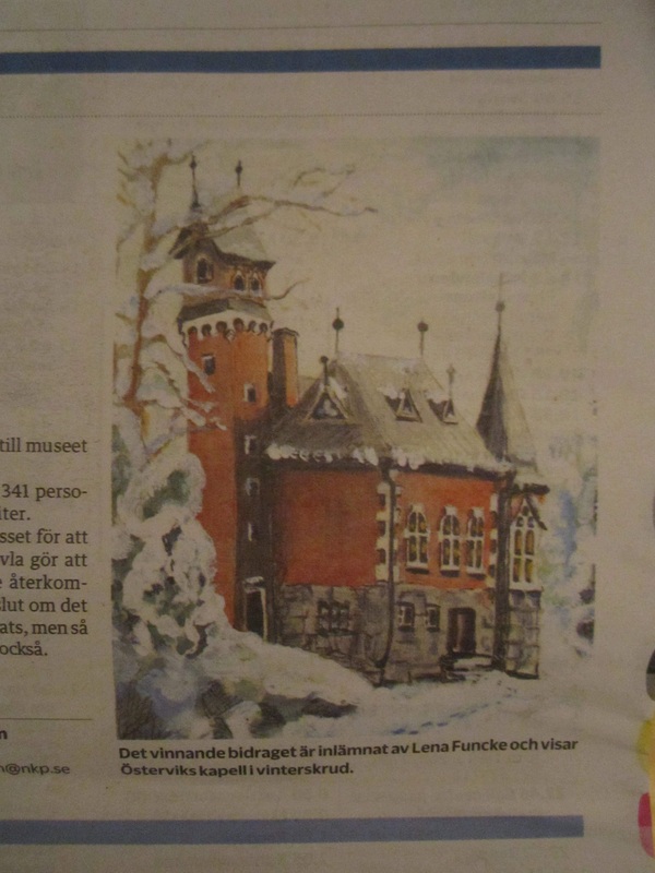
|

 RSS Feed
